Room-by-Room Decor Plan: Modern, Cottage, Boho & More
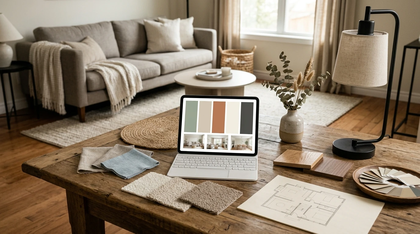
A Room-by-Room Decorating Plan for Modern, Cozy Cottage, Boho, Industrial, and Eclectic Homes
Create a cohesive, lived-in look without starting from scratch. This guide breaks down five popular styles, shows how to mix them confidently, and gives a practical checklist to move from inspiration to a finished space—one room at a time.
Start With a Simple Style Map
The fastest way to avoid “pretty, but random” is to make a simple style map before buying anything. Choose a primary style (your base) and one secondary style (your accent) so decisions stay consistent from room to room. Then set three non-negotiables for the whole home—think warm neutrals, natural textures, and black metal accents—and repeat one element (a wood tone, a metal finish, or a signature color family) everywhere.
When you’re unsure, use the 60/30/10 rule as a filter: 60% base style, 30% supporting style, 10% personality pieces that make the space feel like you.
Style Signatures and Easy Add-Ons
| Style | Core palette | Materials & textures | Fast upgrades |
|---|---|---|---|
| Modern | white, beige, charcoal | smooth woods, glass, matte finishes | swap to streamlined hardware; add one large abstract print |
| Cozy Cottage | cream, sage, soft blues | linen, wicker, painted wood | layer throw blankets; add a skirted side table or slipcover |
| Boho Chic | warm earth tones, jewel accents | rattan, macramé, kilim, mixed patterns | add a textured rug; hang a woven wall piece |
| Industrial | black, rust, concrete gray | metal, reclaimed wood, leather | add an iron shelf; use factory-style lighting |
| Eclectic | balanced mix of warm + cool | varied, curated combinations | create a gallery wall; group objects by color to reduce visual noise |
Build a Cohesive Color and Texture Foundation
To reduce room-to-room clashes, choose one neutral foundation—warm white, greige, or soft taupe—and let it act as the “quiet background” across your home. Add two supporting colors that show up in textiles and art (pillows, throws, prints) rather than big-ticket furniture so you can pivot over time. If you like guidance for palettes and undertones, Pantone is a helpful reference for exploring families of color (https://www.pantone.com/).
Then layer textures in threes: something soft (linen/knit), something natural (wood/jute), and something structured (metal/ceramic). Finally, use contrast intentionally—plush with sleek, matte with shine, light with dark—to create depth without adding clutter.
Living Room: Layout, Anchors, and Finishing Touches
Start with the anchor that makes the whole room look “done”: the rug. Choose a size that fits at least the front legs of the sofa and chairs. This one choice often fixes the floating-furniture look and instantly makes seating feel connected.
Next, build a lighting trio: overhead + a task lamp (reading) + ambient light (candles or soft LED). For foundational guidance on lighting layers and comfort, the National Lighting Bureau is a useful resource (https://www.nlb.org/).
To mix silhouettes without chaos, keep upholstery tones consistent (for example, all warm neutrals) and vary shapes and materials instead (curved chair + square sofa, wood table + metal lamp). Then style surfaces with the odd-number rule: group 3–5 items in different heights—book stack, vessel, small object.
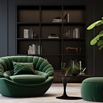
If you’re blending industrial and cozy cottage, try a black metal floor lamp paired with a linen shade and a warm throw. If you want a bold centerpiece that sets the tone, a statement seating piece like the Luxury High-Back Recliner Sofa Set can become the room’s “north star” for color and scale.
Bedroom: Calm, Comfortable, and Personal
In bedrooms, bedding is the main styling lever. Keep sheets neutral, then bring color through quilts, pillows, and a throw so the look stays restful and easy to update seasonally. A reliable formula for an inviting bed is: fitted + flat sheet, duvet, quilt/coverlet, 2 sleeping pillows, 2 shams, and 1 lumbar pillow.
Use symmetry where it helps—nightstands and lamps create instant calm—then add asymmetry for character with art, a chair, or a small stack of books. For boho chic warmth, pair a natural fiber rug with layered patterns that stay in the same color family. For modern calm, keep patterns minimal and elevate the room with one oversized statement artwork above the bed.
Kitchen and Dining: Practical Upgrades That Change the Feel
Create a dining focal point with a centered pendant and a simple tablescape that can stay out daily. For planning basics like clearances and functional layout, NKBA guidelines are a solid reference point (https://nkba.org/).
Entryway and Hallways: Small Areas With Big Impact
A single sculptural accent such as the Vintage Resin Vase works well for console tables, shelves, and entry trays—especially when paired with something organic like branches for height.
A Practical Checklist for Decorating Without Overbuying
If you prefer a single reference you can reuse from room to room, the Interior Home Décor Ideas digital download guide and decorating checklist helps keep measurements, must-haves, and upgrade order in one place—useful for renters and homeowners focusing on reversible updates.
Style Pairings That Work (and Why)
FAQ
How can different styles be mixed without looking messy?
Pick a clear base style, limit your palette to a neutral plus two supporting colors, and repeat the same metal finish or wood tone across rooms. Keep large furniture cohesive, then use one or two standout “personality” pieces (art, a bold rug, or a vintage find) to add character without visual chaos.
What should be bought first when decorating a room?
Start with layout and measurements, then buy the biggest anchors (rug and seating/bed) before lighting and window treatments. Finish with art and accessories last so everything fits the scale and color direction you’ve already established.
How can a cozy look be created on a small budget?
Prioritize textiles (curtains, pillows, throws), warm lighting, and secondhand décor, then edit clutter so the room feels calmer. Simple swaps like cabinet hardware, thrifted frames, and styling with books and plants can add warmth without a full overhaul.












Leave a comment