Wearable Pattern Trends: Style Prints With Confidence
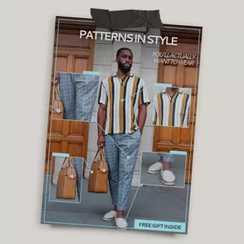
Patterns in Style You’ll Actually Want to Wear: A Trendy Checklist for Getting Prints Right
Patterns are everywhere until it’s time to get dressed—then suddenly every print feels like “too much.” Our printable, digital-download checklist is built to make pattern trends wearable: which prints are showing up now, how to choose the scale that flatters, and simple outfit formulas that keep the look intentional instead of costume-y. If you’ve ever loved a print online and then froze when it came time to style it, our team made this for you.
What “wearable pattern trends” really look like
Trendy doesn’t have to mean loud. The most useful patterns slide into outfits the same way a great neutral does—by repeating a color, a shape, or a mood you already wear. If you already live in denim, blazers, clean sneakers, or simple knits, you can absolutely wear prints without feeling like you’re trying on a whole new personality.
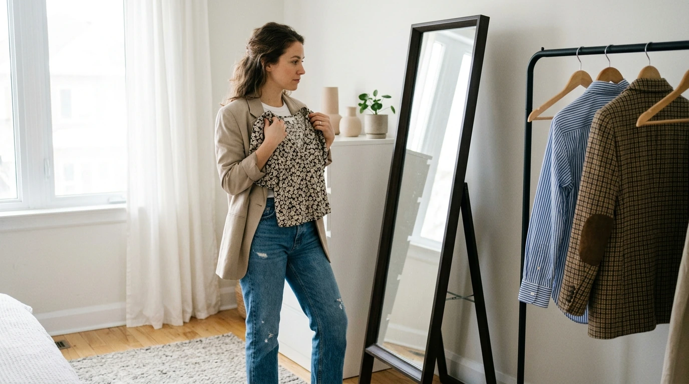
The fastest way to make a new print feel like you is to pair it with a familiar silhouette: your go-to straight-leg jeans, your favorite blazer shape, or a no-fuss knit. Fabric matters, too—patterns read differently depending on texture and movement. A crisp cotton stripe feels polished; a drapey floral feels romantic; a glossy geometric can feel evening-ready without adding extra “stuff.”
Our checklist is designed for real closets: quick decision prompts, outfit pairings, and a simple way to compare prints without overthinking.
Quick pattern-to-outfit matchups (save or print)
| Pattern direction | When it works best | Easy outfit formula | One styling “rule” that keeps it clean |
|---|---|---|---|
| Stripes (classic or bold) | Workdays, travel, casual polish | Striped top + straight-leg denim + loafers | Repeat one stripe color in your shoes or bag |
| Florals (small or oversized) | Weekend, date night, spring/summer layering | Floral skirt + solid knit + sneakers or sandals | Keep the top solid and match its color to a petal tone |
| Checks & plaids | Fall/winter, layering, smart casual | Plaid overshirt + tee + black jeans + boots | Let plaid be the only pattern; keep the rest matte and simple |
| Animal-inspired prints | Night out, statement days, minimal outfits | Leopard belt or shoes + monochrome outfit | Treat it like a neutral and limit to one focal piece |
| Geometric/abstract | Modern looks, events, statement separates | Abstract blouse + tailored trousers + sleek flats | Choose one strong color from the print and build around it |
What patterns are trending—and how to wear them without feeling overdone
Stripes keep cycling because they’re easy to repeat through accessories. If you want a subtle boost, go vertical for a lengthening effect; if you want a more current feel, try mixed stripe widths in the same palette. Florals are showing up at both extremes: tiny-and-dainty and big-and-graphic. Choose based on your vibe—soft and romantic or bold and statement.
Checks and plaids are a layering shortcut: one plaid outer layer can make basics look styled in seconds. Animal prints are trending most as accents (belt, bag, shoe) and as streamlined pieces in simple cuts (think slip-style skirts or straight-leg pants). Abstract and geometric prints are the fastest way to update a minimal wardrobe—especially when the color palette is limited, so the print looks intentional rather than chaotic.
If you like anchoring your choices in established color direction, resources like the Pantone Color Institute can help you notice which hues are being emphasized season to season. For a broader view of fashion leadership and initiatives, the CFDA is another solid reference point.
The checklist method: choose the right scale, contrast, and placement
Our team built the checklist around three decisions that determine whether a print feels wearable on a real day: scale, contrast, and placement.
Scale: Smaller prints read subtler at a distance; larger prints read bolder even in neutral colors. If you want “pattern, but make it calm,” start with smaller scale. If you want the print to be the point, go larger scale and keep the rest simple.
Contrast: High-contrast prints (black/white, sharp color blocking) look crisp and graphic; low-contrast prints look softer and easier to blend into your existing closet. If you’re pattern-shy, low contrast is your easiest win.
Placement: Patterns near the face pull attention upward; patterns at the hem or on bottoms can feel grounded and easier to wear. When you want a print to feel “less loud,” move it away from your face (skirt, pants, shoes) and keep your top solid.
Outfit formulas that make patterns feel effortless
How to mix patterns (without looking like you got dressed in the dark)
What comes with the digital download (and how to use it fast)
Shop our picks
- Patterns in Style You’ll Actually Want to Wear – Trendy Fashion Checklist (Printable Digital Download)
- Vintage Resin Vase
- Muscle Relaxation Toolkit for Total Tension Relief – 3-in-1 Bundle for Deep Muscle Relaxation
FAQ
Which patterns are easiest to start with if patterns feel intimidating?
Start with stripes, small checks, or low-contrast prints so the look reads calm from a distance. Wear one patterned item at a time and keep everything else solid, or begin with an accessory (belt, scarf, or shoes) to ease into bolder prints.
How many patterns can be worn in one outfit without it looking busy?
A practical limit is one statement pattern plus one subtle pattern, max. Keep at least one or two shared colors between them, choose different scales, and add solid pieces to create clean visual breaks.
How does the printable checklist help when shopping online?
It gives you a quick way to judge scale, contrast, and placement before you buy, so you don’t end up with prints that feel louder in real life than they looked on screen. You’ll also check for an easy color echo and confirm you can build multiple outfits with pieces you already own.









Leave a comment